Friday, August 13, 2010

Tag Tuesday Challenge August 10: Crowns


OK, crowns. I happen to have a little bag of sequin crowns on my desk I had picked up at Joannś for $1 to use in a mini book I am making for my niece who starts kindergarten in two weeks. She would not like lime green - LOL - just the pink and purple pul-leeeze! Didn´t know what I would do with the green when this week´s challenge popped up. Voila! The background is various glimmer mists - whenever I have leftover on my craft mat I run tags through it - often mixing several colors on tags. Cat is from Lost Coast designs, flourish is an old wood mount with no ID, pink glitter on bottom is chunky german glass glitter. This is what the cats at my house think they look like. No doubt. Thanks for a fun challenge Louise!


OK - a little note here - I have a rule that I do NOT look at anyone elseś tag (except Louise´s of course) until I have mine finished and posted - no undo influence, etc. So after I posted, I went to the beginning of the list and started looking. The juxtaposition of Tracy Mś tag and mine is the reason I love this challenge...the extremely different interpretations on any given day....thatś all.

Wednesday, August 11, 2010

Life is a Journey...


and this is a book about it. Hereś what I know...women scrap about their children, their travels, their heritage, their families....just about everyone but themselves. So this is a book about you...where you´ve been, where you are now and a page or two for where you are going next....

It has a vintage/shabby chic feel and lots of room for journaling. There is plenty of stamping and a few new tricks. I will show you a simple binding method that you can use on any size book. It is made using the Lost and Found collection of paper and oodles of tags. yes, oodles. There is ribbon and trim - both vintage and new. A charm or bead on every page....and buttons, brads and idea-ology elements. Each page has a theme and i will provide you a list of journaling questions if you are stumped. When you sign up for the class you will receive a supply list and a list of the eighteen pages. If you want, you can bring your photos and place them on the pages as we go. This is an intermediate class - you need to know how to stamp & emboss and the basics of using distress ink in order to keep up! As always, I hope you put your own spin on the pages...there will be lots of options for that! It will be a fun, fast paced day and I hope you can join us.

Here is a peak at part of one of the pages...your favorite color. You will start with white ribbon and flowers and make them any color your heart desires...and go from there. Picture ideas...things in your favorite color, how you have used it in your life, you wearing it...any thing at all. Journaling ideas...what your favorite color was when you were a little girl, when you were a teenager, why it is your favorite color, what other colors you love, what color do you hate and never use...I could go on and on...and that is just about color! You get the idea...and there are 17 other pages to fill up.

Short of ideas? Can´t think of what you would say about yourself? There are already lots of interesting women signed up for the class - they are happy to share and not afraid to offer their ideas and opinions - so you will be inspired!

The class is being offered twice - an all day session on Saturday, August 28th from 9 am to 6 pm OR in a two part format on two Sunday afternoons in September, the 12th and the 26th. Some people prefer to work all day and get it done and some people max out after about 5 hours and would rather split it up in to two days. Hopefully one of these options fits in your calender. UPDATE: the August 28th class is sold out although there are some spots left in the Sunday sessions. If you are already signed up, would you please add a small circle punch to your supply list - any one that is one half to seven/eighths inch in diameter will work. It will work a little better if everyone has their own....thanks!

Grunge Roses Class


This fun class is all about the flowers!! We will make grungepaper roses ala Wendy Vecchi as well as other flowers. You will make 3 grunge roses of different sizes so you get lots of practice. We will use the Sizzix Tim Holtz Tattered Florals die to make grungepaper flowers swhich we will cover with dictionary paper for that vintage look and use another izzix die to make little teeny paper roses.

ATC Class


My bad. Sorry I haven´t updated the blog for a while - ok, a month. I get busy creating and forget the tech side. The picture is of an ATC I made for the ATC class next week. It was a little hard to make samples because the point of this class is to be very freewheeling. ATC stands for Artist Trading Card and they are meant to be traded, never sold. They are always 2.5 inches by 3.5 inches and they can be done in any media you want. I will show you how to work with the little Inkssentials metal frames and Idea-ology fragments but the real point is just to make ATCś. I will have lots of papers, some trim, eyelets, brads, buttosns and of course lots of stamps. And inks, paints, glitter and embossing powders. The stamps in the picture are from the new Tim Holtz Halloween stamps. Bring along any fun embellishments or papers you want to use. Looking forward to some inky goodness....

Sunday, July 11, 2010

Star Seashell Book

This is an August class to wrap up the summer. It has a seashell theme and a quote about the sea on the cover. You may of course make a custom cover and call it Cruise 2010 or the name of your favorite lake. Or it could just be a dream book. After we make the star book we will put together the 5 spreads and the cover. The back of the pages could hold extra pics or journaling. Let us take a look....


The book from above....


The book as displayed...it is meant to be left open and standing on a bookshelf or a coffee table...or anywhere you have a little space. The book is 7¨ tall and each page is 5¨ (although the internal page is 6" wide).


The first spread....embossed on the left.


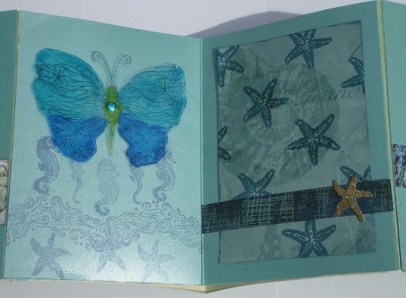
The second spread. Big chip board shell has a fun paint technique on it.


Love how the stamp on the left matches the paper in the middle spread.


This butterfly is much prettier in real life...it is alcohol inks on a piece of transparency and it is quite shimmery...but hard to photograph!


The last spread...perfect pearls...you didn´t think I would do this and not use Perfect Pearls! They look like seashells.


The cover when the book is closed and tied. That little panel is the one that can be customized to say whatever you would like. Hope you can join me for class... it will be fun! August 12th and 22nd at Scrapbooks Too.

Tag Tuesday Challenge #58: Summer


OK, I finished this a week ago but have had trouble getting new camera batteries to take a picture of it -LOL. So the background is peeled paint and broken china distress ink. Seashells are stamped in olive archival ink and Beach is stamped in black pigment ink and then traced over with a black glaze pen. The piece of shell paper is edged in Stampendous Sand embossing powder - which really does look like sand in real life. The beach stamp is from Impressions Obsession and the shells are a lot of unmounted stamps I have collected over time.

Tuesday, July 6, 2010

I have been published...


for the second time, but as big a thrill as the first time! Someone in a class told me she had seen my cards in Take Ten; I did not know if she meant last summers issue or the new one. I went online and in the little preview they run for the magazine I could see one of the cards I had submitted so I knew it was true. Like a total geek I checked the bookstore everyday for over a week before they finally had a copy and I could see it for real. I contacted Stampington and they sent me out a copy which arrived on Saturday with a sweet message!! There are 3 cards and one of the details in the back. Not sure how good the images are but I will try and post them here...if you have the magazine they are on page 14, 22 and 28...and Stampington photography is always excellent. Tomorrow I will find all the stamp credits and post the ones I do not remember off the top of my head.


The arc de Triomphe is an Oxford Impressions.


The mannequin is from Lost Coast designs and the Thanks is an old Stampin´ Up.


The changed the directions on this one to say computer print the sentimentS when it should have been the singular. The ¨even cowgirls get the blues¨ is part of that cool stamp. I did print the ¨Hang in there...¨ on my computer before I inked and distressed it. The little copper stars are way cooler then this pic...they are just chipboard painted and inked but they look like real old hammered copper.